Rita is one of the very first dancers I dressed, way back in the late 1980's. She has never stopped enjoying ballroom dancing. She is now retired, and her investment advisor told her she would need to take money from one her investments this year, and her thoughts turned to dance. She decided she would compete at Arthur Murray Dance-O-Rama this month, and wanted a new ballgown to wear for the event. And she called me!

The criteria we worked with were, soft, flowing, elongated, and elegant. And Rita had no trouble choosing colors and fabrics. She wanted lace, and chose a piece called Desire, which I really liked working with. Since she wanted the result to be soft, we selected a georgette skirt, with a satin chiffon lining.

Rita chose two pinks, a blue based one, called Carnival (upper left, folded to the right), and a more balanced but slightly warm one, called Hawaii Pink (folded to the left side), both from DSI in England. Blending warm and cool pinks has always been a challenge for me personally, but I really liked this combo. I think the Carnival by itself is near to "Radiant Orchid", the Pantone color of the year for 2014, (although ballroom brighter!) and the blend of the two is kinda magical, much more so in person than what I am capable of capturing in my camera.
We kept the lighter, bluer color (Carnival) on top, in the lace and georgette, and put the deeper, hotter Hawaii Pink under the lace in dance crepe and a satin chiffon for the underskirt. This is the logical thing to do, as lighter colors tend to move toward the eye, and darker ones, to retreat. (In all fairness, cool colors should receed and warm ones advance, but I think in this case, value trumps hue.) In the rhinestone application, I was able to leave some of the Carnival lace visible, which I think turned out really nicely. The curvilinear stoning emphasizes the beautiful shapes in this lace, while letting the lighter color beneath it help to pull the pattern forward.

I am also very proud of the matching job I did with the lace in this gown, the bi-lateral mirror symmetry of which is really featured nicely in the back. I was also able to use the edges of the lace fabric to create a scalloped edge at the bottoms of the sleeves, neck edge and skirt connection point.

At the gown front, where the center seam is replaced by two side seams to accomodate bust shaping, the lace looks more organic, but I am still super happy with the figure placement, and think you really have to look for the seams to see them.

Rita had a necklace she thought might be good with the gown, but it really didn't work out. The shapes and sparkles were pretty different, so I made her this piece, which I think works nicely with the scalloped edges of the neckline. I made a couple flowers we did not use on the dress, and attached clips to them for use in her hair. Those flowers really demonstrate nicely the warm and cool pinks in the gown. :)
We originally had two layers of the georgette over the satin chiffon lining, but they were too blue, and we reconfigured them to alternate, achieving a really good color match between bodice and skirt.

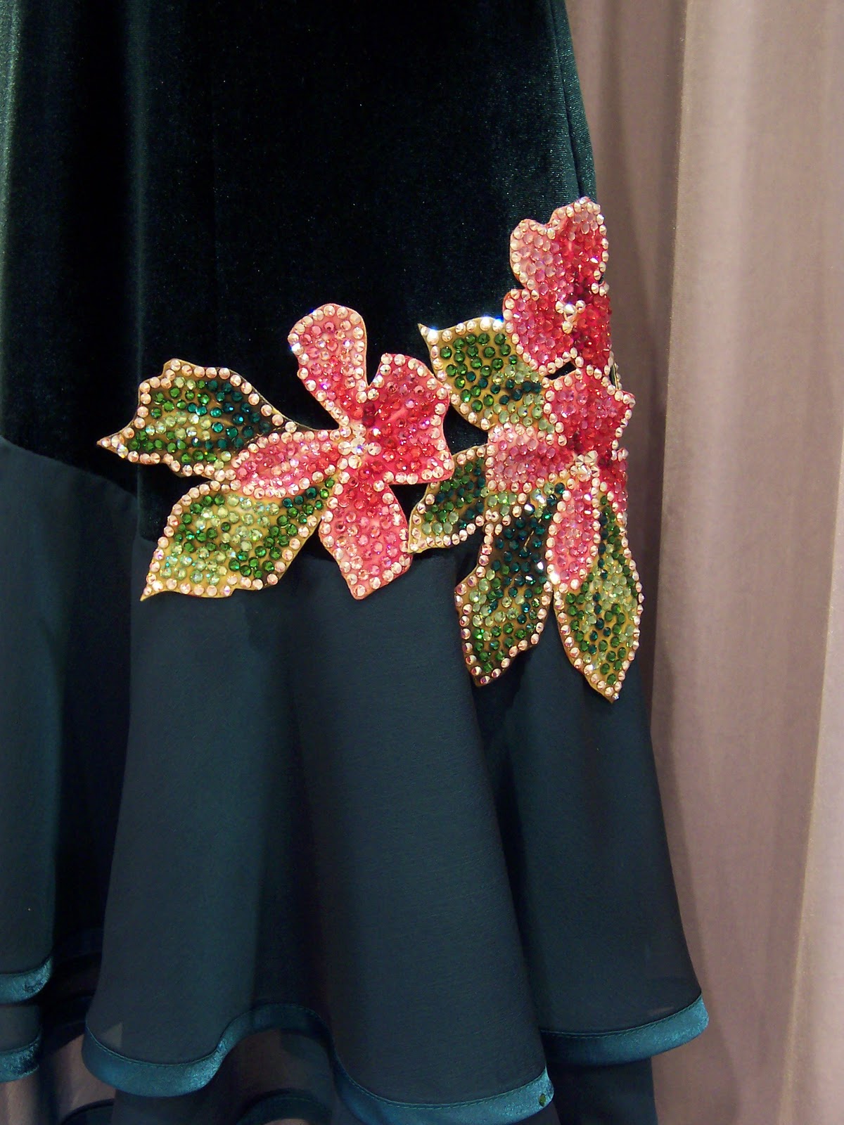
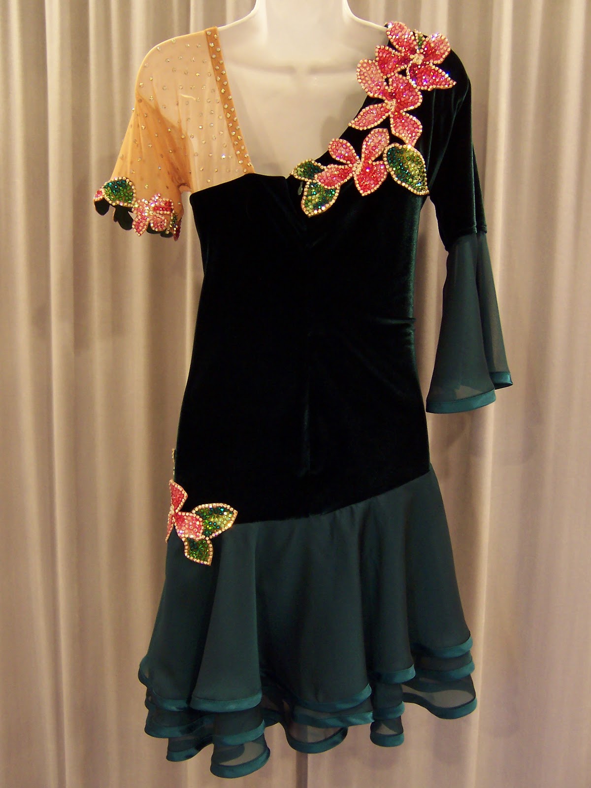
The flowers were not part of the original design. The gown probably would better meet the "elegant" part of the design criteria without them. But listening to Rita in her fittings, talking her performance nerves, and about being encouraged to be more expressive and joyful in her dancing, I thought she might be best served by both providing a focal point on the gown, and by offering a little whimsy.
Best of luck to Rita , who has practiced in the dress and seems happy with the results! I am so glad to have the opportunity to be a part both of the beginnings, and the maturity of her dance career. Are you wondering about that first gown? Styles and construction have changed over the years, but it's still a pretty thing

The criteria we worked with were, soft, flowing, elongated, and elegant. And Rita had no trouble choosing colors and fabrics. She wanted lace, and chose a piece called Desire, which I really liked working with. Since she wanted the result to be soft, we selected a georgette skirt, with a satin chiffon lining.
Rita chose two pinks, a blue based one, called Carnival (upper left, folded to the right), and a more balanced but slightly warm one, called Hawaii Pink (folded to the left side), both from DSI in England. Blending warm and cool pinks has always been a challenge for me personally, but I really liked this combo. I think the Carnival by itself is near to "Radiant Orchid", the Pantone color of the year for 2014, (although ballroom brighter!) and the blend of the two is kinda magical, much more so in person than what I am capable of capturing in my camera.
We kept the lighter, bluer color (Carnival) on top, in the lace and georgette, and put the deeper, hotter Hawaii Pink under the lace in dance crepe and a satin chiffon for the underskirt. This is the logical thing to do, as lighter colors tend to move toward the eye, and darker ones, to retreat. (In all fairness, cool colors should receed and warm ones advance, but I think in this case, value trumps hue.) In the rhinestone application, I was able to leave some of the Carnival lace visible, which I think turned out really nicely. The curvilinear stoning emphasizes the beautiful shapes in this lace, while letting the lighter color beneath it help to pull the pattern forward.
At the gown front, where the center seam is replaced by two side seams to accomodate bust shaping, the lace looks more organic, but I am still super happy with the figure placement, and think you really have to look for the seams to see them.
Rita had a necklace she thought might be good with the gown, but it really didn't work out. The shapes and sparkles were pretty different, so I made her this piece, which I think works nicely with the scalloped edges of the neckline. I made a couple flowers we did not use on the dress, and attached clips to them for use in her hair. Those flowers really demonstrate nicely the warm and cool pinks in the gown. :)
We originally had two layers of the georgette over the satin chiffon lining, but they were too blue, and we reconfigured them to alternate, achieving a really good color match between bodice and skirt.
The flowers were not part of the original design. The gown probably would better meet the "elegant" part of the design criteria without them. But listening to Rita in her fittings, talking her performance nerves, and about being encouraged to be more expressive and joyful in her dancing, I thought she might be best served by both providing a focal point on the gown, and by offering a little whimsy.
Best of luck to Rita , who has practiced in the dress and seems happy with the results! I am so glad to have the opportunity to be a part both of the beginnings, and the maturity of her dance career. Are you wondering about that first gown? Styles and construction have changed over the years, but it's still a pretty thing