Showing posts with label costume. Show all posts

Wednesday, February 24, 2016

Bonnie's Black

It used to be no one wanted a black ball gown for competition.  Black is the color of almost every gentleman on the floor.  Universal belief is that the man is a frame and the woman should be a picture.  SO... a black picture in a black frame?  But when champions and winners wear something, then everyone wants it. Lots of winners have been wearing black lately, and Bonnie is a woman who looks great in black.  She has striking blonde hair, great skin and beautiful features.

When she told me she wanted a black gown, I had to agree it would be beautiful on her.  But I also know that she will wear this gown for a while and wanted her to be visible, and not instantly out of date, when this trend shifts, as they all do.  I encouraged her to add a color to her black gown, at the very least white, or lots of crystal AB sparkle.


After lengthy negotiation and multiple re-designs, we finally landed on an acceptable solution, which included the addition of both a partial white side and a red accent.


Black soft boning hem adds shape and movement.


The gown converts for International Style Ballroom by means of the skirt becoming a float.  Another scarf float attaches to the center back of the necklace, designed just for the Ballroom.  Bonnie has a simpler necklace for use in the American Smooth style.  Isn't she lovely?  I have the best clients!

Tuesday, November 27, 2012

Susan's Plum,Tangerines, and Cherries

 
I can't wait for you to see the rest of this gown, because many of you might wonder about a combination of plum and tangerine and cerise, but there is a really good reason, and a nice cohesion to this rich, warm gown!

 
So, here is the explanation!  This tropical floral print was brought in by Susan, and it was a great starting point, providing the vibrant and unusual color palette for her new ball gown.  Susan trained as a ballet dancer and came to ballroom later in her career.  From watching her dance just a bit here in my studio in testing her costume, I image she is a beautiful, joyous, powerhouse on the competition floor.   This bold print and it's vibrant colorway seem just perfect for her.


When she arrived for her design meeting, Susan had this piece of fabric and a dark purple piece she thought might be an underskirt that would be visible from beneath the floral print.  I asked her to take the purple piece home.  I really enjoy working with prints, but experience tells me that a busy print requires careful design handling to be successful.  When the entire gown will not be the print, the colors used in conjunction need to be from the middle value range in the print.  Either end of that range (in this case, the white or the purple) is too much contrast, and the print and strong contrasting colors war with each other for focus.   This gown has several textures and details, but they all flow together to create an interesting whole, primarily because of the value choices.  I also find that it possible to use shapes with prints, but they must be similar in feeling, and since this print is very organic, a straight purple line at the hem would have been a clash in intention.  The diagonals, and flowing, color-shifting drape we used, have the same shapes as those in the print, and the dynamics compliment each other nicely.


Susan seems the sort to be a good performer as well, so we created a primary impact point at her face with the jewelry design, using the pale pinks in the Crystal AB Swarovski to exploit the power of contrast as a focusing tool.  I also image her port-de-bras is excellent, and the cuff bracelet will draw attention to beautiful arm use.

 
We also carefully kept the cutting of the fabric to a minimum with the design of the skirt shape, to allow it to be seen without interruption of line by seams any more than necessary.
 

Thank you Susan!  I really enjoyed making this gown and working with your beautiful print, and I love the great action shots Helen sent to me.  You really are a glorious dancer!


Thursday, September 6, 2012

Kate: Shaken, Not Stirred

Sometimes, the jewelry is almost the most important part of the costume!
Kate wanted a elegant and sexy look for her new Rhythm gown.  Something that one of James Bond's consorts might have worn.  Something with a lot of class and a little flirt.  Something a little dangerous!  She had a skirt shape in mind when she arrived.
A soft, sheer but satiny skirt with lots of movement.  And enough sparkle power to dazzle a guy like James.
And maybe a few bracelets?  Just for good measure?
Shoeless, makeup-free, and without the usual quarts of hair product, when she picked up her gown... she looked GREAT!  What a beautiful back!!!
 
And in action...  WOW!
I think Gordon even has "Bond Hair!"  It's always a pleasure, Kate.
Visit Kate at her own wonderful blog, Riot and Frolic!


Sunday, December 18, 2011

Patty's Quest for Emerald

Sometimes, a color is all important.  Patty came to my studio in search of the perfect emerald green for a new Rhythm gown.  Ballroom fabric suppliers provide a beautiful vibrantly pure (and sometimes neon) array of colors in a variety of fabrics, but greens for the last several years have been more on the yellow side of the color wheel than on the blue.  And Patty's dream color was on the blue side.  She had seen Oscar gowns in this magical but elusive color and nothing else would work. I think she was especially interested because her red hair is a new adventure for this octogenarian(!), and she really wanted to feature and flatter her spicy auburn.  Doesn't she look fantastic?


Her friend Randee came to her design meeting and helped work out our design.  Digging through my sources and scraps, we found a piece of silk in the perfect color to order for the skirt, and a scrap of satin lycra in my studio for a sash, but the stretch lace she wanted for her bodice did not exist in that particular emerald color.

So, off to superb dyer Marliss at Iris Color Studio I went, with a sample of white lace in the pattern Patty had chosen, to see if it could be made the perfect color.  Marliss did MANY tests.  The netting and portions of the flowers were nylon and other parts of the flowers were rayon, and the two fibers require different dyes.  Marliss struggled to get a deep, rich, vibrant enough color in either fiber.
Marliss's first samples, close, but not achieving the dream.

 When she mentioned the greatest challenge was getting the green to be both blue and vibrant enough, I mentioned the lace also came in bright, pure turquoise.  She was thrilled with the turquoise sample I took her and assured me that we could go ahead with the gown and she could get the color, particularly since the colored version of the lace was all nylon.

But I had to convince Patty that Marliss would come through.  Patty mentioned that having a  gown custom-made is a scary thing for her.  Trying to calm her fears, I suggested that even buying dancing lessons was potentially scary.  Teachers can demonstrate what steps and styling go with an Associate Bronze syllabus, and you can see how the dance looks on the teachers.  But what will you look like, doing those things?  You just have to trust the professionals to do their job, with your best interest at heart.  The same is true with custom dance wear design, but the difference is, when you are finished with the process, you have a valuable, re-sellable product.  What you learn in a dance lesson program is with you for your life and beneficial in a multitude of ways, but you cannot recoup any of the money you have spent, whereas, most gowns are good for a minimum of 75% of what you paid for them when you are ready for a new one, and that is a better value than buying a new car.  Fortunately, Patty gave me the go-ahead!

The turquoise lace Marliss over-dyed, and the final, perfect result.
Marliss came through brilliantly, and we cut, basted, assembled and fit Patty's gown.  I am especially proud of the lovely cuff detail on the sleeve.

Cuff Detail
I am also proud of the beautiful pattern match I achieved at the center back of the gown.  Lace yardage motifs can be very different sizes depending on where the pattern occurs on the piece, and blocking two pieces to exactly match each other is a tricky proposition.  Adding a zipper into the mix increases the challenge, but this worked out beautifully!

I am also happy with the beautiful edge I created with the lace selvedge.  And the rhinestone pattern works nicely with the lace pattern to emphasize shapes and edges, as well as providing all-over sparkle, while still allowing the vibrant emerald color to shine through.

I'll add one final shot of Patty dancing from the Dancer's Studio Showcase event last night.  I was not able to attend, but Patty had many family members and friends there to cheer her on and kindly shared these images with me.  Congratulations, Patty on your beautiful new gown, and on your performance!  I look forward to our next collaboration.


Wednesday, May 25, 2011

Jane's Purple Volcano

Sometimes my clients want to change the image they present on the competition floor, and Jane was ready for a change.  Here's her first rhythm gown, which I thought looked very nice on her, and obviously had good movement as well.  It was not a Made for Movement gown, although I did adjust the fit for her.  I think it is playful and fun, and a bright, vibrant and visible color, all good things on the floor.  I also thought the bare chest and shoulders were flattering.

But Jane wanted a change.  Something more "grown-up" looking, and more understated and elegant.  So we set to work on a design that would flatter her body, and create the impression of elegance and maturity.  We started with a deeper richer color, and a more complex grouping of lines and shapes.  We softened the skirt, removed some weight, and used a more transparent fabric to feature her pretty legs, although we wanted to maintain good potential for movement in the skirt so used a similar volume of fabric. 

We also moved the focus from the center of her body to one side and  provided a vertical division.  We achieved this division in two ways.  We used opaque draped dance crepe on one side of the gown and sheer stretch mesh on the other side, as well as using different embellishment on each side.  We also found a bronze scrollwork applique we thought might provide a hint of vintage antique aesthetic to use a a base for our rhinestone decoration.

Decorating this gown was fun.  We chose a Swarovski effect crystal called Volcano for the scrollwork details and the sheer mesh portion of the gown.  Effect crystals are a different color viewed from a different angle.  Volcano viewed directly from the front is a pinky purple, but as you move to the side for an oblique view, it turns a green gold.  One stone, multiple colors.  This too added a mysterious complexity to the gown.  You can see the effect at work by looking at the bust area of the gown in this photo.  As we view the crystal headon at the bust point, the purple color blends into purple mesh, providing just sparkle.  Beneath the bust, where you view the stone at an angle, you can see the vibrant gold color of the effect, and as your eye traces the curves, you can see the transition from purple to pink to deep, bronzy gold. We used Amethyst crystals on the opposite draped crepe side, which are simply purple from all angles, providing lots of sparkle, but less color drama.  All of the scrollwork is embellished with larger Volcano crystals, and even some big sew-on jewels for added punch.  We did the embellishment work in stages, allowing Jane to decide how much sparkle she wanted to see and consequently, allowing her to choose the final cost of her gown.  Jane chose plentiful rhinestone embellishment, and was pleased with her decision.  We did not stone the skirt, wanting to keep the focus on the pretty shape of the handkerchief hem, and allow our eyes to see though the fabric to her shapely legs.  I like the assymetrical balance of this gown.


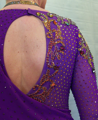
Since we were not revealing as much skin at the top of the gown, we opened one sleeve with a keyhole and embellished it with our scrollwork applique. 

We also opened a keyhole at the back of the gown.

And here is a shot of those lovely legs in their new skirt.

We do not yet have competition photos to post, but I have seen Jane's video from Wisconsin State, and both she and her new gown look wonderful. and move beautifully!  I think we achieved Jane's elegant new look successfully.

We are in the process of creating a new ballgown as well, and I am enjoying working with Jane again!  When we are finished, I look forward to sharing our work with you.

Tuesday, May 10, 2011

Randee's Hot Magenta

I have the most amazing clients!  Take Randee for example.  Randee is a former model and makeup artist, as well as a dancer.  She was willing to spend HOURS doing her hair and makeup in preparation for picking up her new gown and allowing me to take some photos for my blog.  I'd like to think my photography skills are improving, but in this case, I suspect it's the subject that improves my images.

Randee and I are both happy with the entire gown, but there are some particular elements I'd like to show off.

First, I have to give credit to my friend Marliss Jensen of Iris Color Studio.  Together, about 10 years ago, we worked out the process we use to create the shaded ombre effect featured in the skirt.  I choose colors (in this case, just the one) and Marliss prepares a dyed swatch to test the color accuracy and allow me to plan where I want the transitions to take place. I prepare the silk by washing it, cutting and sewing the skirt panels with silk thread, so stitches will dye with the silk, and even finishing the seams with silk surging thread.   Then I create a muslin jig and sew it to the bottom of the skirt, to give Marliss a means to control the mass of fabric at the hemline, as well as something to hang onto while dipping the skirt, upside down, into the dye vat.

In this case Marliss did her swatch on a piece of silk I had in my shop, but the stuff I ordered had been "dyed" white, infused with something to whiten the natural color of the silk.  She really had to work to get the "whitener" out and the color in as we wanted it to be, but as usual, she did a fantastic job. The color is one of Chrisanne's newest for 2011, called Hot Magenta.

Take a look at the bottom of the right sleeve, a pretty idea of Randee's.


The custom jewelry was designed for Randee to work specifically with this gown.  We co-ordinated the shape of the necklace with the shape of the necklline. The earrings were carefully planned to flatter her lovely chin and neck.  We wanted a big, chunky cuff for her bare arm, to call attention to her arm and hand styling, and I think this fits the purpose nicely.

If I told you her age, I promise you, you would fall out of your chair, and never again have a working excuse for a sagging jaw or wobbly underarm.

And speaking of pretty body parts, I think her back looks fantastic as well! And I would say the hours of hair styling paid off beautifully.


A HUGE thank you to Randee for letting me share her gorgeous new gown with you right away.  She won't have a chance to wear it until Twin Cities Open in July, but was kind enough to allow me to debut it here.  I can't wait to see some action shots.  In parting, here are a couple of other projects Randee and I have done together.